The Yale logo embodies Yale’s identity and assures audiences of a publication’s strong connection to the university. The Yale logo features a direct and confident “Yale” set in a modified version of the Yale typeface. It is carefully proportioned to work at small and moderate sizes in all publications—web and print. Please follow guidelines for use to ensure that the logo retains its impact as the official mark of the university.
Uses
The Yale logo should be included on all publications of the university—web and print—to affirm the publication’s status as emanating from Yale.
The Yale logo should be used in all situations that call for the official mark of the university. For example, it should be used as the mark of the university in publications and at public events that visually represent Yale as a sponsor.
Only with the approval of Yale Trademark Licensing may the Yale logo or wordmarks be used in non-Yale publications or event displays.
Using multiple logos
While it’s common practice to display groups of logos in print and web communications, it is Yale’s practice to avoid the visual clutter of this method of recognizing multiple sponsorships. For example, when several Yale organizations have sponsored an event, only the wordmark of the primary Yale sponsor may be used in the collateral materials. The names of the other sponsors should be listed in text. If one sponsoring organization does not rise above the others, only the Yale logo—without an organizational extension—may be used, with all participants listed in text. The same rules apply to collaborations and partnerships with non-Yale commercial and academic entities. All entities involved should be listed in text, but only the Yale logo or a single Yale wordmark may be used.
Only with the approval of Yale Trademark Licensing may the Yale logo or wordmarks appear in non-Yale publications. When such use is approved, the Yale logo or wordmarks may appear alongside others in those publications or event settings.
There are instances in which this policy may require consultation. Please contact the Office of the University Printer if you have questions.
Placement
When used in a Yale publication, the Yale logo does not need to be a prominent display element. It can function at small to moderate sizes to brand a publication as a Yale product. The Yale logo functions best when placed on the back cover of a print document or at the foot of a print or webpage.

Examples: Yale logo corner in document (left), Yale logo website corner (right)
Scale
In print, the Yale logo should be large enough to ensure legibility and a proper hierarchical relationship to other typographic elements. On the web, the Yale logo should be no smaller than the version shown in the footer of this page.
The Yale logo must be scaled proportionally.

Examples: Do not scale horizontally or vertically

Alignment
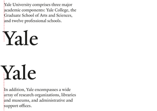
When appearing below text, the Yale logo is most comfortable aligned so that the left arm of the “Y” (at the point where it meets the serif) aligns with the left edge of the text.
When appearing above text, the Yale logo is most comfortable aligned so that the lower left serif of the “Y” aligns with the left edge of the text.

Clearance
Always reserve a cushion of open space around the Yale logo. The height of the “Y” is approximately the minimum amount of clearance to provide.

The Yale logo should not be used as a foundation from which to construct new logos. Departments and programs interested in developing new marks must contact the Office of the University Printer.

Color & background
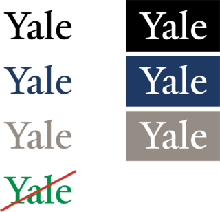
The Yale logo may only be shown in black, white, Yale Blue, or Yale Gray. Specifications for Yale Blue and Yale Gray can be found on the Colors page.
The preferred background colors for a white “drop-out” Yale logo are black, Yale Blue, and Yale Gray.
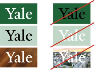
Other background colors are permissible. If using a background color other than black, Yale Blue, or Yale Gray, the Yale logo must appear in white against a dark background or black against a light background.
Maintain contrast between the background and the logo to ensure legibility. Never print it against or dropped out of a busy background that compromises its visibility.

The logo may be printed against or dropped out of a photographic image only if it remains highly visible and legible.