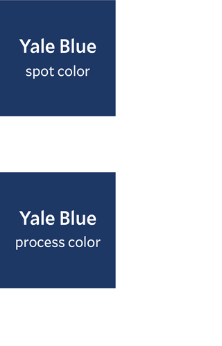
Official Yale Blue, spot color
Ask your designer and printer to match the official swatch book color, or specify Superior Printing Ink Co.’s Yale Blue ink formula, HB 6254 (for coated paper) or HB 6255 (for uncoated paper). Specify an inline aqueous coating or varnish for all jobs with areas of solid color to prevent bronzing, reduce rub-off, and ensure an acceptable color match.
Official Yale Blue, process color
For coated paper: CMYK 100, 75, 8, 40
For uncoated paper: CMYK 100, 70, 5, 35
Because of differences in paper, ink, and equipment, these process build percentages are provided as general guidelines only. Ask your designer and printer to match the official swatch book color. Specify an inline aqueous coating or varnish for all jobs with areas of solid color to prevent bronzing, reduce rub-off, and ensure an acceptable color match.
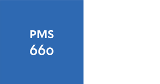
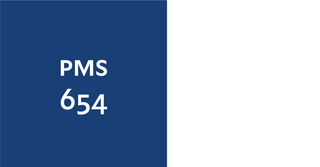
If the specified Superior Printing Ink Co. formula cannot be obtained for conventional printing, use PMS 648C for printing on coated paper and for all inset and silkscreen projects. For conventional printing on uncoated paper, use PMS 295U. Consult with vendor to determine the choice of ink for coated or uncoated use before providing a digital file.
For projects requiring a paint color match for Yale Blue, use Benjamin Moore 2064-10 Bold Blue or ask your vendor to match the official swatch book color.