History

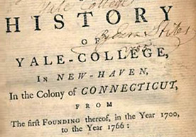
Yale College typeface on paper

Yale Typeface

About the Yale typeface

The Yale typeface incorporates in its design many of the formal characteristics of the old-style typefaces used in Yale publications since the eighteenth century, exemplified by the History of Yale-College (1766) illustrated here. The Yale typeface is directly based on what some scholars consider to be the seminal typeface of Western culture—the “De Aetna” face—designed in about 1495 by Francesco Griffo, working in Venice. A copy of the De Aetna, by Pietro Bembo, resides in the Beinecke Rare Book & Manuscript Library.

“Yale” is inspired by the late-fifteenth-century Venetian typeface that first appeared in Pietro Bembo’s De Aetna, published by Aldus Manutius in 1495. A copy of this book may be found in the collection of the Beinecke Rare Book & Manuscript Library at Yale.

Aldus Manutius was among the most prolific and successful publishers of printed books in his day, and the De Aetna face was used to set a number of his scholarly publications which were widely distributed and admired in Renaissance Europe. Arguably, it has had the greatest influence upon subsequent type design of any Renaissance typeface.

In 1929, Stanley Morison of the Monotype Corporation in England led a project to revive Aldus’s De Aetna face. The resulting typeface, Bembo, proved to be one of the most widely used and highly regarded book faces of the twentieth century. It appeared regularly in Yale publications of all kinds. Unfortunately, digital versions of Bembo lack the vigor and weight of either the De Aetna face or the original Monotype version of Bembo.

Matthew Carter’s “Yale” recovers the strength of the Aldine original and updates it by sensitively simplifying the essential letterforms and their details. Aspects of the drawing and “color” of the well-known typeface Galliard, an earlier Carter design, are also evident in the Yale face.

First developed for use in Yale’s current signage initiative, the Yale typeface was modified and extended to include bold roman and bold italic fonts suitable for print and Web work; it is provided in the OpenType file format which is cross-compatible with Macintosh, Windows, and Unix operating systems.
About Matthew Carter

Readers of current periodicals, typographers, and users of computer design and word processing programs have all come into contact at one time or another with the work of Matthew Carter. He has created many well-known typefaces in frequent use today. Carter shares his expertise with the University as a Senior Critic on the Graphic Design faculty, Yale School of Art, where he has served for more than forty years.

Matthew Carter is a type designer with more than fifty years’ experience of typographic technologies ranging from handcut punches to computer fonts. After a long association with the Linotype companies he was a co-founder in 1981 of Bitstream Inc., the digital type foundry, where he worked for ten years. He is now a principal of Carter & Cone Type Inc., in Cambridge, Massachusetts, designers and producers of original typefaces.

His type designs include ITC Galliard, Snell Roundhand and Shelley scripts, Helvetica Compressed, Olympian (for newspaper text), Bell Centennial (for the U.S. telephone directories), ITC Charter, and faces for Greek, Hebrew, Cyrillic, and Devanagari, an alphabet used in India. For Carter & Cone he has designed Mantinia, Sophia, Elephant, Big Caslon, Alisal, and Miller.

Carter & Cone have produced types on commission for Apple, Microsoft (the screen fonts Verdana and Georgia), Time, Newsweek, Wired, U.S. News & World Report, Sports Illustrated, The Washington Post, The Boston Globe, The Philadelphia Inquirer, The New York Times, BusinessWeek, and the Walker Art Center.

Carter speaks frequently at conferences, colleges, and chapters of the American Institute of Graphic Arts.

Carter is a Royal Designer for Industry, a member of AGI, and past chair of the type designers’ committee of ATypI. He has received the Frederic W. Goudy Award for outstanding contribution to the printing industry, the Middleton Award from the American Center for Design, a Chrysler Award for Innovation in Design, the AIGA medal, and the Type Directors Club medal. He holds the honorary degree of Doctor of Fine Arts from the Minneapolis College of Art and Design. In 2010 he was named a MacArthur Fellow by the John D. and Catherine T. MacArthur Foundation. Read more about Matthew Carter.