Welcome

A guide to Yale’s visual identity

Use these standards to unify and elevate Yale’s communications.

  • Yale colors

    Explore the iconic Yale Blue and a palette of appropriate accent colors.

    Yale colors
  • Yale logo and wordmarks

    All Yale’s schools and units use the Yale logo and wordmarks.

    the Yale logo in dark blue on a light gray background
  • Yale typefaces

    Learn about the Yale typeface and additional recommended fonts for print and digital.

    Yale typeface

Download assets and templates

From the Yale logo to branded templates for video, presentations, and more, quickly find all the assets you need for your communications project.

View assets and templates
Detail of architectural stone carving depicting three books bound with a belt.

Find resources and support

Explore related key policies and guidance, including information on copyright, accessibility, working with vendors, and how to request assistance.

See support resources
Detail of an architectural stone carving depicting a person reading a book.

About the Yale Identity

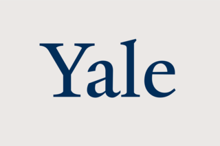
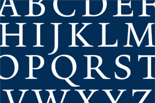
For more than a century, Yale has employed graphic arts professionals to shape and support its communications efforts. In 1920, Carl Purington Rollins, an established printer and designer, was appointed Printer to the University, making Yale the first institution of higher education in the United States to establish such a role. Rollins spent the next 30 years designing thousands of books and ephemeral pieces. This body of work for Yale is the typographic foundation of the “look and feel” that distinguishes the university to this day. 

Contact us

For questions about the Yale Identity or to request a consultation, you may submit an inquiry to the Office of the University Printer.